How to Build a Better MongoDB Report With AI Suggestions in MongoQUI
Your product team asks a simple question: which categories have the highest average rating? The data is available, but turning it into a useful report takes several decisions. You need to choose the right dataset, define the average, build the query, and present the result clearly enough for someone else to use. MongoQUI’s AI Suggestions can help you get started. They give you proposed report blocks and queries to review, so you can spend more time checking the answer and improving the report.
Start with the data that can answer your question
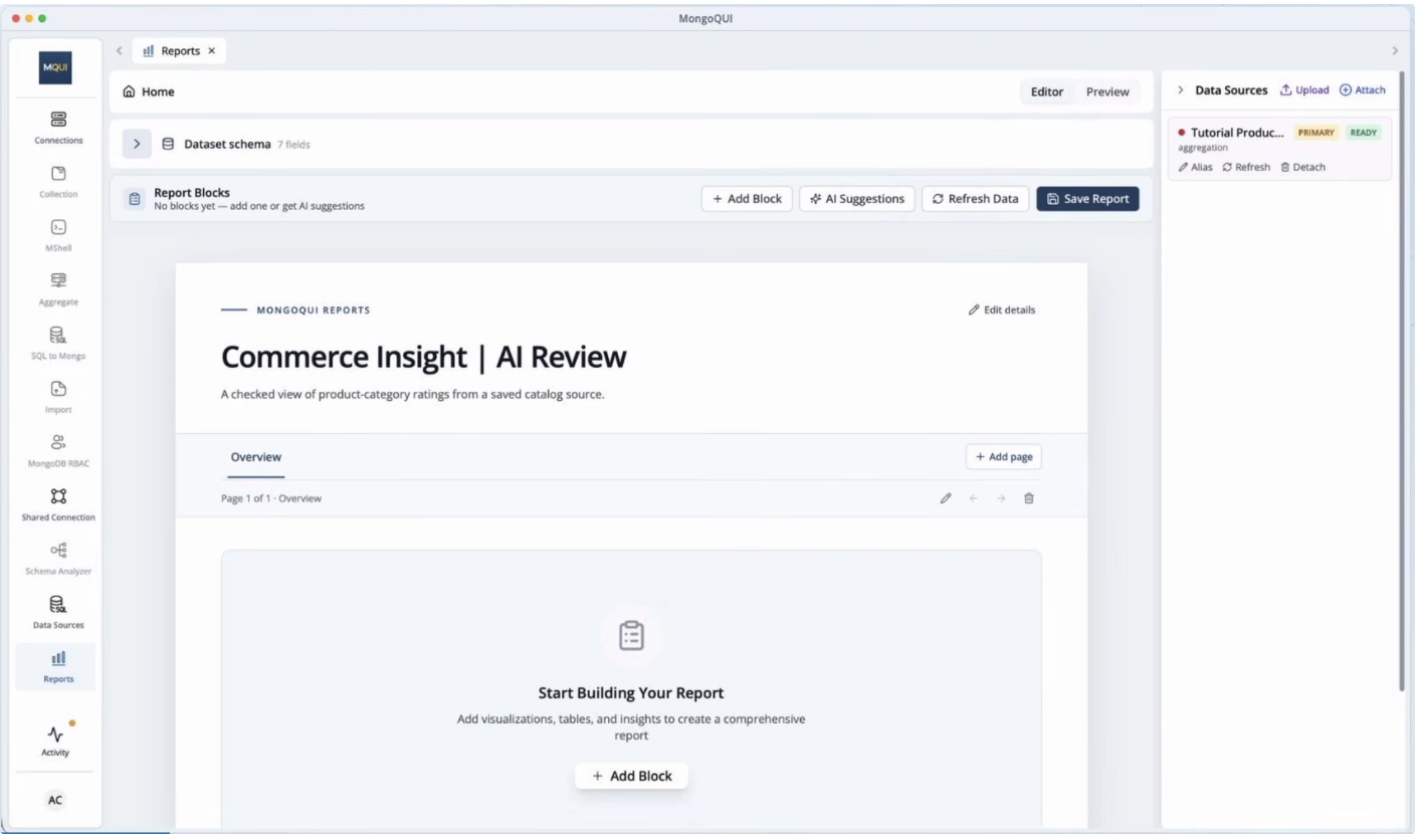
Before requesting suggestions, choose the relevant ready data source in Report Builder. If your report contains several sources, confirm that you are working with the one that contains the product categories and ratings you want to compare.
This choice determines what the report can tell you. A dataset containing one row per product answers a different question from a dataset containing one row per customer review.
For example, averaging product-level ratings gives each product equal weight. Averaging individual review scores gives each review equal weight. Both calculations can be useful, but they describe different things.
Check the available fields and a few records before proceeding:
What does each row represent?
Are category names consistent?
Are ratings numeric, and are any missing?
Does the source cover the products and period you intend to analyse?
These checks give your prompt a clear foundation.
Give AI Suggestions a focused hint
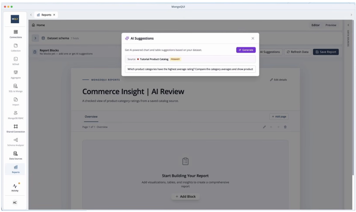
A request such as “show me insights” leaves many reasonable interpretations. A focused hint makes the intended comparison clearer.
For a product-level dataset, an example is:
Compare the average product rating across categories, with the highest average first.
This is an illustrative prompt, rather than a transcription of the video. It identifies the metric, grouping, and preferred order in one sentence.
You can use the same approach for other questions: orders by status, revenue by region, or ticket counts by priority. Start with one question that the selected source can answer. Review the suggestions before adding extra conditions.
Choose a chart that makes the comparison easy
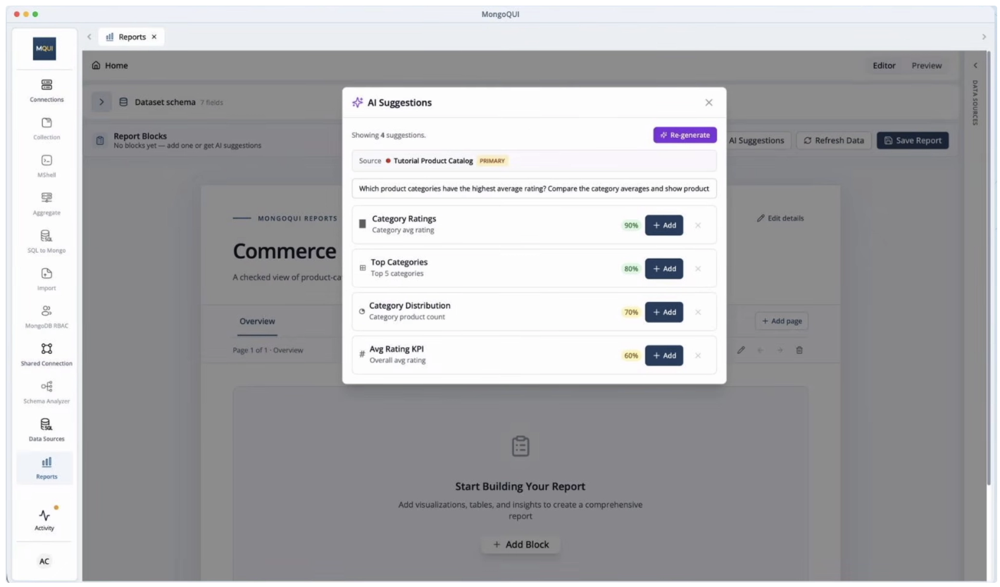
For category averages, a bar chart is a useful starting point: readers can compare the values across named groups. A table may work better when the team needs exact values alongside additional context.
A suggested chart still needs an editorial decision. Does it answer the question you asked? Are the labels understandable? Does the title explain the measure?
“Average Product Rating by Category” gives the reader more context than “Category Performance.” If the source covers a limited period or subset of products, explain that scope in the report too.
Inspect the generated query
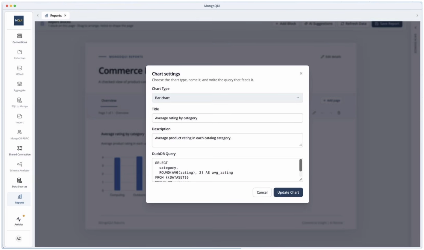
The tutorial includes reviewing the generated DuckDB query and its dataset binding. This matters because the report query operates on the selected report dataset. Check that the query references the source you intended and uses its actual fields.
For illustration, a dataset with numeric rating values and a category column could use this pattern:
SELECT
  category,
  ROUND(AVG(rating), 2) AS average_rating
FROM {{DATASET}}
WHERE rating IS NOT NULL
GROUP BY category
ORDER BY AVG(rating) DESC;
This is an illustrative Report Builder query, not the exact query shown in the video. {{DATASET}} represents the report dataset placeholder; adapt the field names and filters to your source.
Review the grouping, filters, and aggregation before accepting the result. Rounding the final average to two decimal places improves readability. Sorting by the unrounded average retains the underlying ranking when displayed values are equal.
Also consider what the query leaves out. Missing ratings should not silently become zeroes. A category with few rated products may need additional context before someone treats its average as a reliable comparison.
Check what the average means
Imagine a synthetic dataset with two products in the same category:
Product | Average rating | Number of reviews |
|---|---|---|
Product A | 5.0 | 2 |
Product B | 4.0 | 100 |
The simple average of their product ratings is 4.5. An average weighted by review count is approximately 4.02.
That difference changes how a reader might interpret the category. Choose the measure that matches the business question, and label it accordingly. If you use review counts as weights, verify that those counts describe the same reviews and period as the product averages.
This is an additional reporting consideration beyond the video’s described walkthrough. AI can propose a calculation; the report author needs to decide whether that calculation matches the intended meaning.
Verify the chart against the source
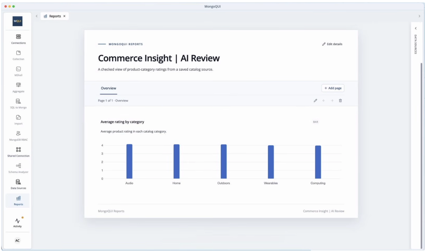
Before saving, pick one category and inspect its underlying records. Calculate the expected average and compare it with the displayed value. Then check a category with missing ratings or a small number of products.
A useful review asks whether the right records were included, whether categories were grouped correctly, and whether the chart agrees with the query output. A query can execute successfully while answering a different question from the one your team asked.
Keep any important interpretation beside the result. A note such as “Each rated product has equal weight; products without ratings are excluded” helps the next reader understand the number.
Save, preview, and reopen the report
Once the values and labels are checked, save the report, preview it, and reopen it.
Look at it from the recipient’s perspective. Can they identify the question, understand the metric, and see the relevant comparison without asking you to explain it?
For a merchandising team, the report could help identify categories worth investigating. For a product manager, it could provide a starting point for reviewing customer feedback. An average highlights a pattern; the next step is to examine the records and context behind it.
MongoQUI brings AI Suggestions, query review, and report creation into the same workflow. The practical benefit is a faster starting point with room to refine the logic and presentation before the result reaches your team.
Try it with one ready data source and one clear question. Request suggestions, inspect the selected query, verify a result, and save a report you can explain. Watch the walkthrough or explore MongoQUI to get started.
Related posts.
Introducing MongoQUI: From MongoDB Data to Answers Your Team Can Use
From exploring MongoDB documents to sharing an answer your team can use. “Which orders still need attention?” The answer is in MongoDB. Getting it into your team’s hands is where the work begins. Someone needs to inspect the records, write the query, check what the numbers mean, and turn the results into something another person can act on. A straightforward question becomes a chain of exports, spreadsheets, and follow-up messages. When someone asks for updated numbers, that chain starts again. We built MongoQUI to make that journey easier: from understanding your MongoDB data to sharing an answer your team can use again. MongoQUI is a MongoDB GUI and workspace that brings database exploration, visual query building, aggregation pipelines, and reporting together. You can investigate a question, build the logic behind the answer, and turn the results into a report within the same workspace. It is built for developers who work with MongoDB, analysts who need to understand its document
MongoQUI Review: The Smarter MongoDB GUI Built for Modern Developers
If you've ever found yourself wrestling with raw shell commands just to inspect a collection or debug an aggregation pipeline, you already know the pain that MongoQUI was built to solve. In a market crowded with aging desktop clients and overly complex IDEs, MongoQUI arrives as a breath of fresh air — a powerful, intuitive MongoDB GUI designed specifically for developers and data analysts who want speed without sacrificing capability.
Get shipping updates once a month.
A monthly digest of what shipped, what’s coming, and one long-form post we loved. Unsubscribe in one click.
By subscribing you agree to receive monthly updates from MongoQUI. See our Privacy Policy.